

The Content Query Viewer Tiles is a Web Part that displays a dynamic set of items sourced in a SharePoint list.
You use a query to specify which items are displayed, and you can set presentation options to determine how those items are displayed on the finished page.
The most popular use is to display tiles (Quick Links) to display links from a SharePoint list
-
Step 1 - Setting up the list
Regardless of the layout you choose, you will need to create a custom SharePoint list that will house the items you will show using the web part. Some of the necessary columns you'll need to add are as follows:- Title - This will be the title of the tile or item
- Icon or Image URL - This will be the visual icon or background image of the item. Use column type Hyperlink or Picture. Your actual icon should be stored elsewhere in a SharePoint library and you will simply add the link to that item within this column.
For using in quick links, your image size should be 54 x 54 pixels with a transparent background at 72 dots per inch.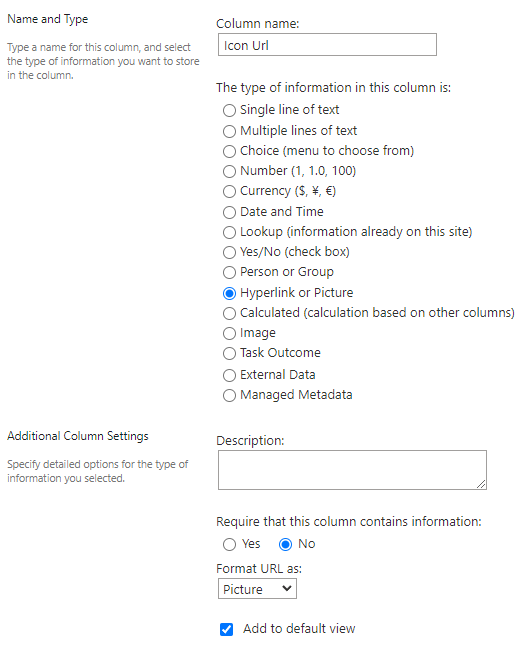
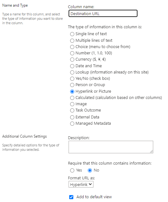
- Destination URL - If you would like users to be redirected or linked elsewhere when clicking this item, you will need to add a destination URL. Use column type Hyperlink or Picture.
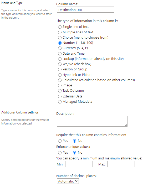
- Sort Order - This will allow you to control the order the items will appear in on your SharePoint page. Use column type Number.
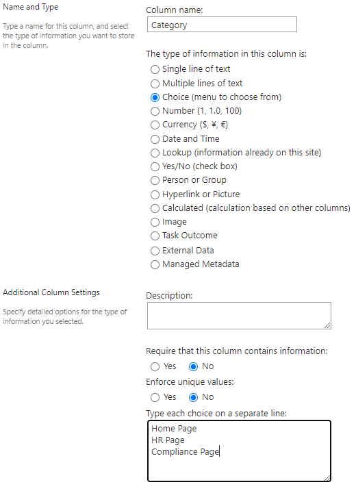
- Category - If you wish to filter your list of items to show specific items on one page and alternate items on another, you can add a Category column that you can use to filter this list. For instance, you may wish to show specific quick links on the home page, HR page, or a compliance/policy page. Use column type Choice.
Your finished list will look like this: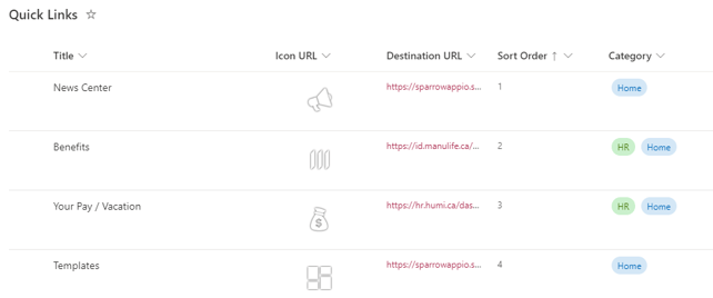
-
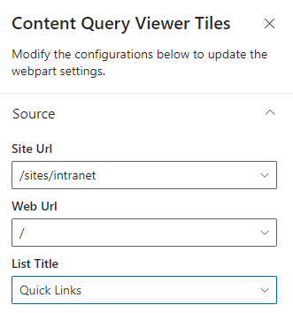
Step 2 - Configure the web part
- Source - Specify the list that you just created in the previous step.
- Site URL - The site where your list is located. Yes, you can show items from other sites in SharePoint!!! 😍
- Web URL - Leave as default
- List Title - The name of your list
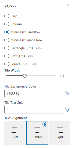
- Layout - Although this is at the bottom of the web part, it is recommended to select the layout you desire prior to the mapping, otherwise you will not be able to view your mapping changes as they occur.
- Layout - Feel free to experiment with the various layouts, but the most common use case is the Minimalist Card Row used for Quick Links (shown at the top of this article)
- Tile Width - Specifies the width of the tile, which can be useful if you have few or many tiles
- Tile Background Color - Sets the background of the tile or item
- Tile Text Color - Sets the text color of the tile
- Text Alignment - Controls the text alignment of the Title text within the item
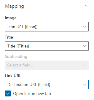
- Mapping - The mapping panel is what associates the list columns to the front end user interface. Regardless of the layout you use, you will need to map the following fields:
- Image - This will represent the background or tile icon
- Title - The title of the item
- Destination URL - Clicking this item will redirect the user to the value in this field
- Open link in new tab - If selected, all items clicked will open a new tab and redirect the user. This is especially useful if you're redirecting users to external links
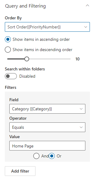
- Query and Filtering - This panel allows you to control the sort order as well as apply any filters to retrieve segmented items
- Order By - Allows you to order the display of items. Depending on your needs, you could also filter by title if you desired an alphabetic listing or modified date for a chronological listing. You can then choose ascending or descending order. Also notice there
- Search within Folders - Allows you to ignore folder structure and retrieve all items from a library
- Filters - This is where your Categories created in a previous step can be utilized! You can specify a value contained in that list column to only show items that match
- Add Filter - This button allows you to add additional filters
There you have it! For additional assistance or if you have questions, please contact support@sparrowconnected.com!
- Source - Specify the list that you just created in the previous step.