
This article contains:
- About Post Viewer Tiles
- General Settings
- Pinned/Featured Posts
- Background
- Header Property
- Optional Data
- Layout
- Inspiration Gallery
About Post Viewer Tiles
Within SharePoint Modern, Sparrow provides functionality through web parts. The Post Viewer Tiles web part allows the presentation of Sparrow posts in a tile format that is highly customizable.
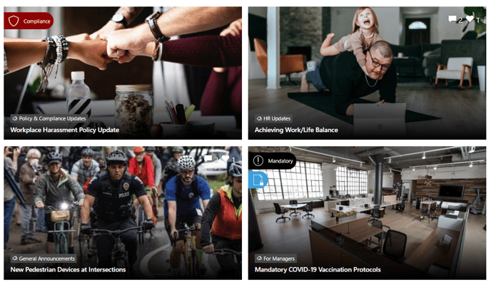
This web part presents Sparrow posts in the following order:
- Mandatory
- Compliance
- Feature
- Standard
In addition, publishers have the ability to create different sections using multiple instances of this web part to create interesting landing pages utilzing topic and audience segmentation.

General Settings
The following settings are available within the General section of the web part configuration
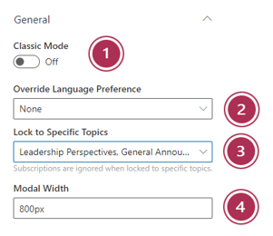
- Classic Mode - Sparrow has 2 ways of presenting a post when it's clicked on
- A pop-up modal form (Modern - Keep the toggle off - RECOMMENDED)
- A redirect to a separate web part (Classic - turn the toggle on)
- Override Language Preference - This setting will ensure the post displays in a specific language regardless of the user preference
- Lock to Specific Topics - By selecting one or more specific topics, you can control which posts this web part will display. This will allow you create dynamic and engaing landing pages with varying content sections.
- Modal Width - This value specifies the width of the pop-up window that appears to show the contents of a post when a tile is clicked
Pinned/Featured Posts
This area allows the publisher to dictate what posts are prioritized within the web part. Options are as follows:
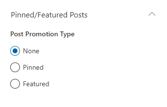
- None – Displays posts in the order they were published and based on post type
- Pinned – Allows the publisher to search for up to 2 posts to prioritize within the tiles
- Featured – Prioritizes any posts marked as featured
Background
The Post Viewer Tiles web part has the ability to display a background color and/or an image. The properties are as follows:
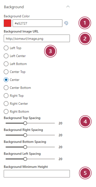
- Background color - This can be set by either pasting or typing in a hexadecimal code (example: #e52727) directly or by more conveniently utilizing the color picker to select your color. Values can be cleared by selecting the background color text and deleting
- Background image url - Specify any url that is accessible by the site. Normally publishers would create a background image, then upload into SharePoint within the Site Assets library (or a library of your choosing). Once again, this value can be removed by selecting the value and deleting.
Once this value is set, additional background image placement options will appear as depicted in the screenshot on right. The various spacing options allow additional padding within the web parts to let your background image shine. - Image Alignment - The various selections here will determine how your background image aligns within the web part container
- Spacing - These sliders will add additional "white space" surrounding the web part tiles
- Background minimum height - If your background image is 500px high, but your actual tiled content amounts to only 400px high, you can specify the exact height you're looking for.
Header Property
Publishers can also set a custom header with an icon to add additional style to your Post Viewer Tiles
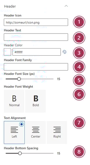
- Header Icon – Specify the url of the icon you wish to use. The recommended size is 50 x 50 pixels. This icon will scale automatically based on your Header Font Size
- Header Text – The text to display as your header
- Header Color – Use the color picker or type a hexadecimal color value
- Header Font Family - Specify the font family desired
- Header Font Size – Use the slider to select the size of your font
- Header Font Weight – Choose from Normal or Bold
- Text Alignment -Choose Left, Center, or Right
- Header Bottom Spacing – Controls the amount of space to appear between the header and the tiles within the web part
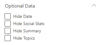
Optional Data
Each tile within the Post Viewer Tiles web parts by default displays the title, summary, social stats and date. You have the ability to hide all fields except title
Layout
As a publisher you have a variety of layouts to choose from to display your Sparrow communication posts. Below is a description of each layout and the scenarios where you would use them:
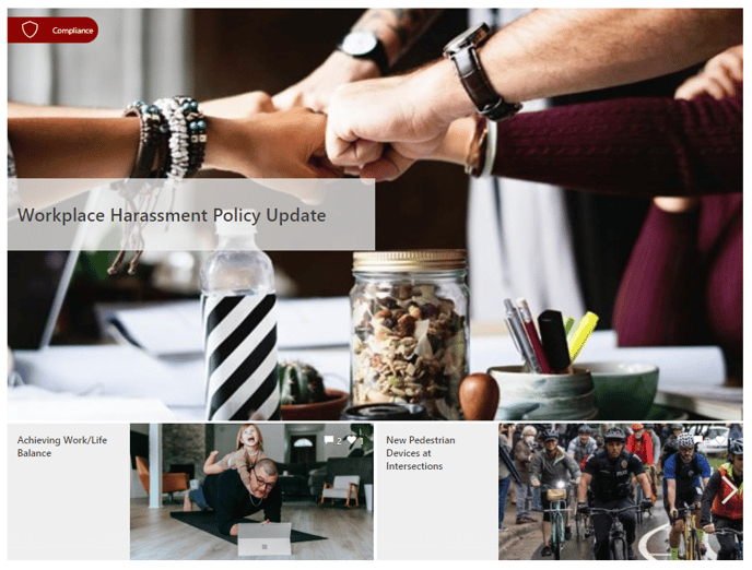
Standard
This is the default layout that displays a primary post and 4 secondary posts. You have the ability to customize the gradient overlay color (default is black) and the topics background color

💡 Best suited for: Primary home page news tiles in a wide column
Showcase
This layout is very similar to the Standard layout, however, it allows you choose whether to display 2 or 4 secondary tiles as well as control the height of the web part. Also, you can control the positions of the images within the tiles. Publishers, with the Showcase web part still have the ability to set the gradient overlay color as well as the topics background color.

💡 Best suited for: Primary home page news tiles in a wide column
Wide
The Wide layout gives prominent treatment to the primary post and shows up to 9 posts total. All secondary posts are accessed via the carousel below the primary post and are navigable by clicking the right arrow
💡 Best suited for: Primary home page or secondary news page tiles in a wide column
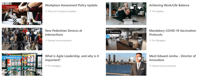
Column
The column layout is great for showing multiple posts with the exact same treatment. Within this layout you can chose number of tiles per row (1 column or 2 column), as well as a maximum number of posts (up to 10). Additional options include – Display image on right (instead of left), tile background color, tile border color, and tile text color.
💡 Best suited for: Secondary news posts (lower priority than primary news) in a wide column
Card
The Card layout allows you easily show a single (or multiple) posts in a card format. You have the ability to set maximum number of posts (up to 10), tile background color, tile border color, and tile text color.
💡 Best suited for: Individual topic posts in a narrow column
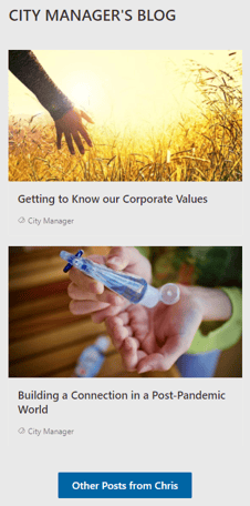
Window
The Window layout is perfect for showing a micro series of posts pertaining to a specific topic and combining with previously discussed features like background image, header icon and header text. You can set the number of tiles per row as well as the maximum number of posts
💡 Best suited for: Series topic posts in a wide column or card tiles
2 Other settings are also available from within the Layout section:
- Gradient color - Specifies the color of the vertical gradient behind your post title text. It is recommended that the gradient is black (#000000) to provide the highest possible contrast to ensure your text is readable
- Topics background color - Sets the background color of the topic label that sits on top of your post image. Once again, dark colors work best