This article contains:
About Posts Central
This webpart allows you to have a “More News” page that displays all news items (or select topics) as a news feed including search and filtering options. It is very similar at first glance to the My Sparrow webpart, however the properties and behavior are different and there is no ability for the user to manage their subscription.
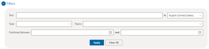
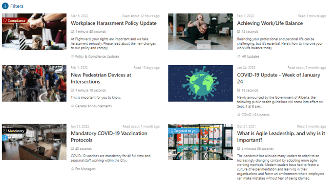
Here’s an example of what the webpart looks like with its filter expanded.
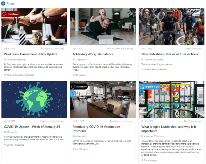
Similar to Post Viewer Tiles, this web part presents Sparrow posts in the following order:
- Mandatory
- Compliance
- Feature
- Standard
General Settings
The following settings are available within the General section of the web part configuration
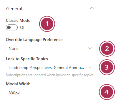
- Classic mode - Sparrow has 2 ways of presenting a post when it's clicked on
- A pop-up modal form (Modern - Keep the toggle off - RECOMMENDED)
- A redirect to a separate web part (Classic - turn the toggle on)
- Override language preference - This setting will ensure the post displays in a specific language regardless of the user preference
- Lock to specific topics - By selecting one or more specific topics, you can control which posts this web part will display. This will allow you create dynamic and engaing landing pages with varying content sections.
- Modal width - This value specifies the width of the pop-up window that appears to show the contents of a post when a tile is clicked
Layout
As a publisher you have a variety of layouts to choose from to display your Sparrow communication posts. Below is a description of each layout and the scenarios where you would use them:
Card
The Card layout allows you easily show a single (or multiple) posts in a card format. You have the ability to set maximum number of posts (up to 10), tile background color, tile border color, and tile text color.
💡 Best suited for: Individual topic posts in a narrow column
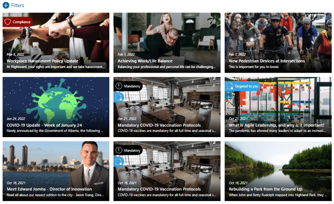
Column
The column layout is great for showing multiple posts with the exact same treatment. Within this layout you can chose number of tiles per row (1 column or 2 column), as well as a maximum number of posts (up to 10). Additional options include – Display image on right (instead of left), tile background color, tile border color, and tile text color.
💡 Best suited for: Secondary news posts (lower priority than primary news) in a wide column
Window
The Window layout is perfect for showing a micro series of posts pertaining to a specific topic and combining with previously discussed features like background image, header icon and header text. You can set the number of tiles per row as well as the maximum number of posts
💡 Best suited for: Series topic posts in a wide column or card tiles
2 Other settings are also available from within the Layout section:
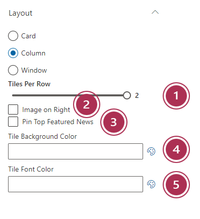
- Tiles per row - Allows control over how many tiles will present per row (Maximum 3)
- Image on right (Column layout only) - Will align the column image to the right instead of left
- Pin top featured news - Determines whether featured posts are pinned to the top of the feed or are just presented in chronological order
- Tile background color - Background color of the tile
- Tile font color - Font color of the text within the tile
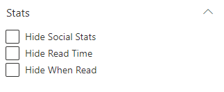
Stats
Hide social stats - This property allows the News tile to suppress showing the number of comments and reactions. This provides an aesthetic option.