Release 3.6.0 - July 13, 2023
Improvements:
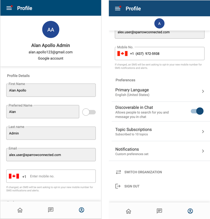
Profile Screens
- Updated all of the profile screens to align with the web portal and bring a more modern look and feel.

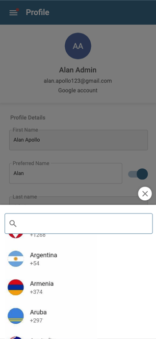
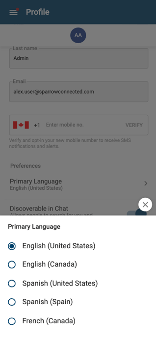
- Updated both the country code and primary language selectors to trays that open from the bottom of the screen, allowing more width for longer labels


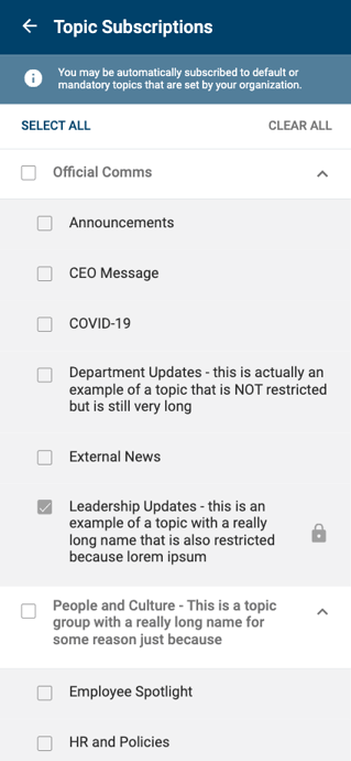
- Updated the formatting on the topic select screen:
- Left align the topic group label and reduce font size
- Changed from black to greyscale font color for topic groups
- Changed topic labels to a darker font color
- Added select all and clear all buttons

Bug Fixes:
- Additional display fixes to embedded Facebook videos
- Some really long comments only displayed a grey box instead of the text
- Clicking a post link from a newsletter would display an error message if the user was not logged in instead of taken them to the login screen
- After logging out of the mobile app on a shared device, the next user to login would receive errors.
- Discoverable in Chat option in user preferences should be hidden if chat is not enabled in tenant settings.
- Sign in banner remained at the top of the news feed even after a user logged in, forcing the user to click the x to close it.
